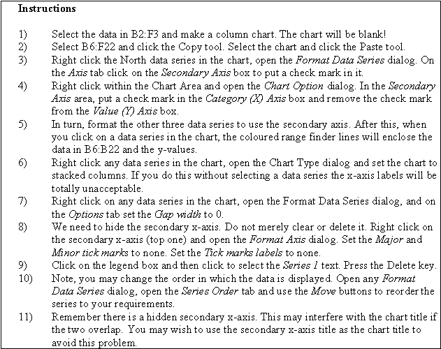
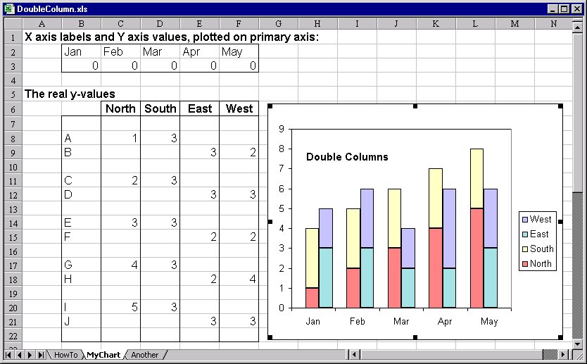
Column Chart with a Difference
Column charts are frequently used to compare different data sets. It
takes a little trick to have Excel make more than one stack but it can be done
– see figures below. The file DoubleColumn
is an Excel file showing how to make
these charts. The method is taken from Stephen Bullen’s page
but the instructions have been expanded.
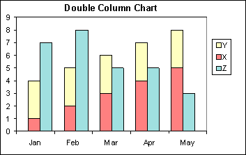 Another example
of a "double column" chart
Another example
of a "double column" chart