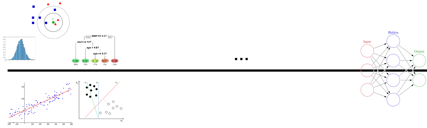
Context
A course for upper-year, non CS students emphasizing utility
Course teaches Hello World — Machine Learning
- At this stage they have seen:
Variables & Types
Loops
Conditionals
Functions
Lists & Numpy Arrays
Dictionaries
Basic Searching and Sorting
File I/O
Pandas
Data Visualization
They do NOT know about Machine Learning yet (next class)
- This would be one of the lectures near the very end of the semester
Typically, these upper-year students are taking the class for exactly these skills (Data Science)
- They are familiar with the website delivery (done to mimic Python docs)
More notes than slides
Discover ideas as opposed to throwing them at the students
- They are used to:
Lecture activities
Interpreter
Notebook style programming
Pencil & paper
Using libraries/packages
This is not a class like software carpentry
Data Science
I remember being amused the first time I heard “Data Science”
- It’s not that well defined to be honest
There are other buzz words that float around with Data Science too
Basically, using math, stats, algorithms, visualization, machine learning, and other forms of analytics to get information from data
- Some have even said that it’s kinda’ like a different paradigm for science
I have no well formulated hypothesis, but I do have data… I wonder if there are some relationships here?
- Data Science is not another name for:
Statistics
Analytics
AI
Machine Learning
Deep Learning
Warning
We’re about to jump about 2.5ish years ahead in your CS education
Normally, you’d learn a whole bunch more CS. Both theoretical and applied
Have some statics and other math classes
If we wanted to do this right, we’d need to learn about:
Complexity theory
Advanced algorithms & Data structures
Linear Algebra
Multivariable calculus
Multivariate statistics (lots of stats, actually)
Even more stats
MORE STATS!
Signal Processing
Information Theory
…
…
…
Data Science
But that’d take too long, so…
We’re going to skip straight to the last step
Seriously?
Yes
Data Science is now too important for me not to show it to you
- Further, doing it right is subjective
For our purposes, we don’t need to be experts in calculus, algebra, statistics, etc. in order to make use of the techniques
What you can expect:
- A very superficial introduction to Data Science
An example of how I would get some data and start playing around with it to see what I can do
You’ll have some ideas about how to apply specific techniques and what they can tell you about data
- In order to avoid getting bogged down in detail, I’m going to play fast and loose with some definitions and concepts
Sorry (or not, depending on your perspective)
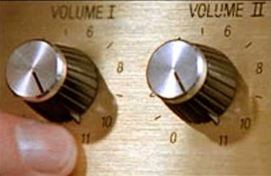
You’ll be able to turn your science up to an 11!
Centres for Vampire Control

If you would like to follow along, please follow this link: Colab Notebook
There is currently a huge vampire plague that’s quite problematic
You have been recruited by the United Nations to join the international Centres for Vampire Control and Prevention (CVC)
It is VERY difficult to identify if a subject is a vampire or not and it requires a lot of expensive testing that takes a long time
- The CVC wants to know if it’s possible to identify vampires base on easy to measure features about the subjects
Height (cm)
Weight (kg)
How averse they are to wooden stakes
If they currently have garlic breath
How reflective they are in a mirror
How shiny/sparkly they are
- The CVC has worked very hard (and spent 100s of millions of dollars) to gather data from 2000 subjects that they have also identified if they are a vampire or not
The last column is 0 if they are human, and 1 if they are a vampire
Upload this to your Colab Notebook if you would like to follow along
Note
In this case our life is easy. We have a clear goal and not too too much data to be overwhelming. Many times life is not this simple.
Playing with Data
Note
I have broken these course notes down into steps, but this should not suggest that these are the standard steps one would always take.
Step 0.0: Look at the data!
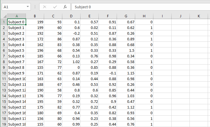
Ok, csv in tabular format
Each row is a subject
Each column is a feature
Step 0.1: Get some imports to get things going
1 2 3 4 5 6 7 8 | # Important Imports
import csv
import matplotlib.pyplot as plt
import numpy
import pandas
import scipy
import scipy.stats
import seaborn
|
At this stage you should be familiar-ish with what these are
seabornis a new one that we will be using here, but it’s just a handy tool that helps make fancy plotsEach of these is one of the highly used tools of a Data Scientist
Step 0.2: Load up the data
1 2 3 4 5 6 7 8 9 10 11 12 13 14 15 16 17 18 19 20 21 | # Loading up Some Data
# Some constants to make life easier later
FILE_NAME = 'CVC_data.csv'
LABELS = ['height (cm)', 'weight (kg)', 'stake aversion', 'garlic breath', 'reflectance', 'shinyness', 'IS_VAMPIRE']
oFile = csv.reader(open(FILE_NAME, 'r'))
data = numpy.array(list(oFile))
# Remove the subject name
data = data[:,1:]
# We can be lazy and just make everything a float
data = data.astype(float)
# If we want to do it all in one line of code
#data = numpy.array(list(csv.reader(open(FILE_NAME, 'r'))))[:,1:].astype(float)
# Putting it into a pandas dataframe
data = pandas.DataFrame(data, columns = LABELS)
|
- We don’t really need to use
pandashere We could easily just use numpy to do everything
- We don’t really need to use
BUT,
pandasdoes provide some easy to use functions that will save some time
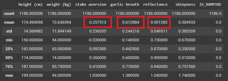
Step 1: Get some simple summary statistics
1 2 | # Summarize ALL the Data
data.describe()
|
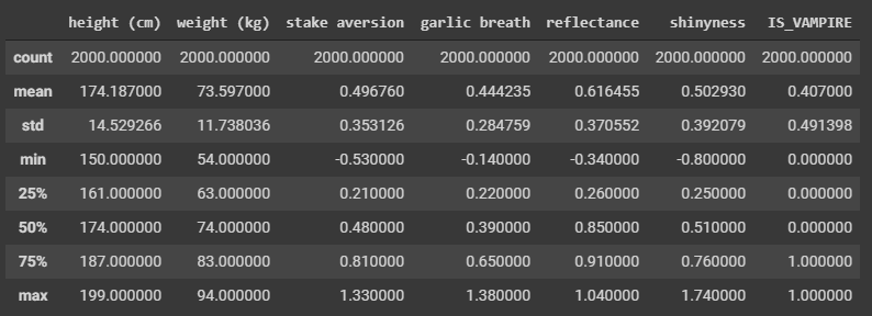
Question
Can you notice anything interesting here based on the summary statistics?
- Not much here, but the mean of 0.407 can tell us one thing I suppose
Huzzah, we learned something from the data!
Perhaps if we break the data down into their respective classifications
1 2 3 | # Select only the rows where they are known humans
dataHuman = data[data['IS_VAMPIRE'] < 0.5]
dataHuman.describe()
|
1 2 3 | # Select only the rows where they are known vampires
dataVampire = data[data['IS_VAMPIRE'] > 0.5]
dataVampire.describe()
|
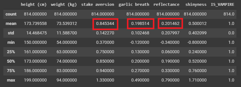
We already found some differences it seems!
Difficult to REALLY say as these are just means/averages
- Also, this is a summary statistic of many samples
Like, how helpful is this if I gave you a new subject and told you their garlic breath was measured as a 0.38?
- We’re not done, but we definitely have something!
All by just getting some simple summary statistics
We could have done this with numpy, but pandas makes this easy for us
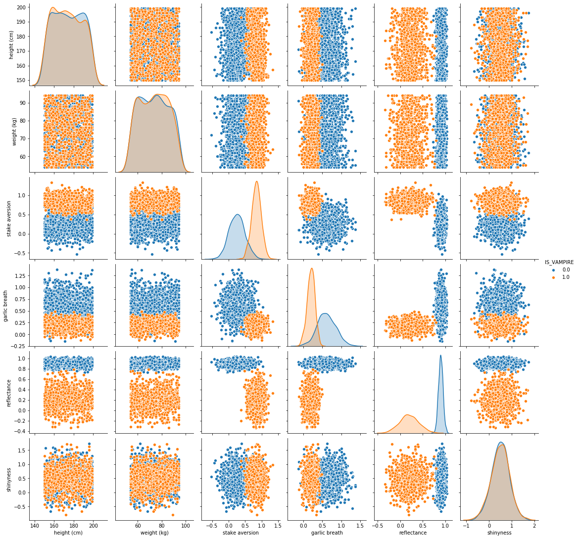
Step 2: Start Visualizing the Data
1 2 | # Create a nice pair plot for all the data
seaborn.pairplot(data)
|
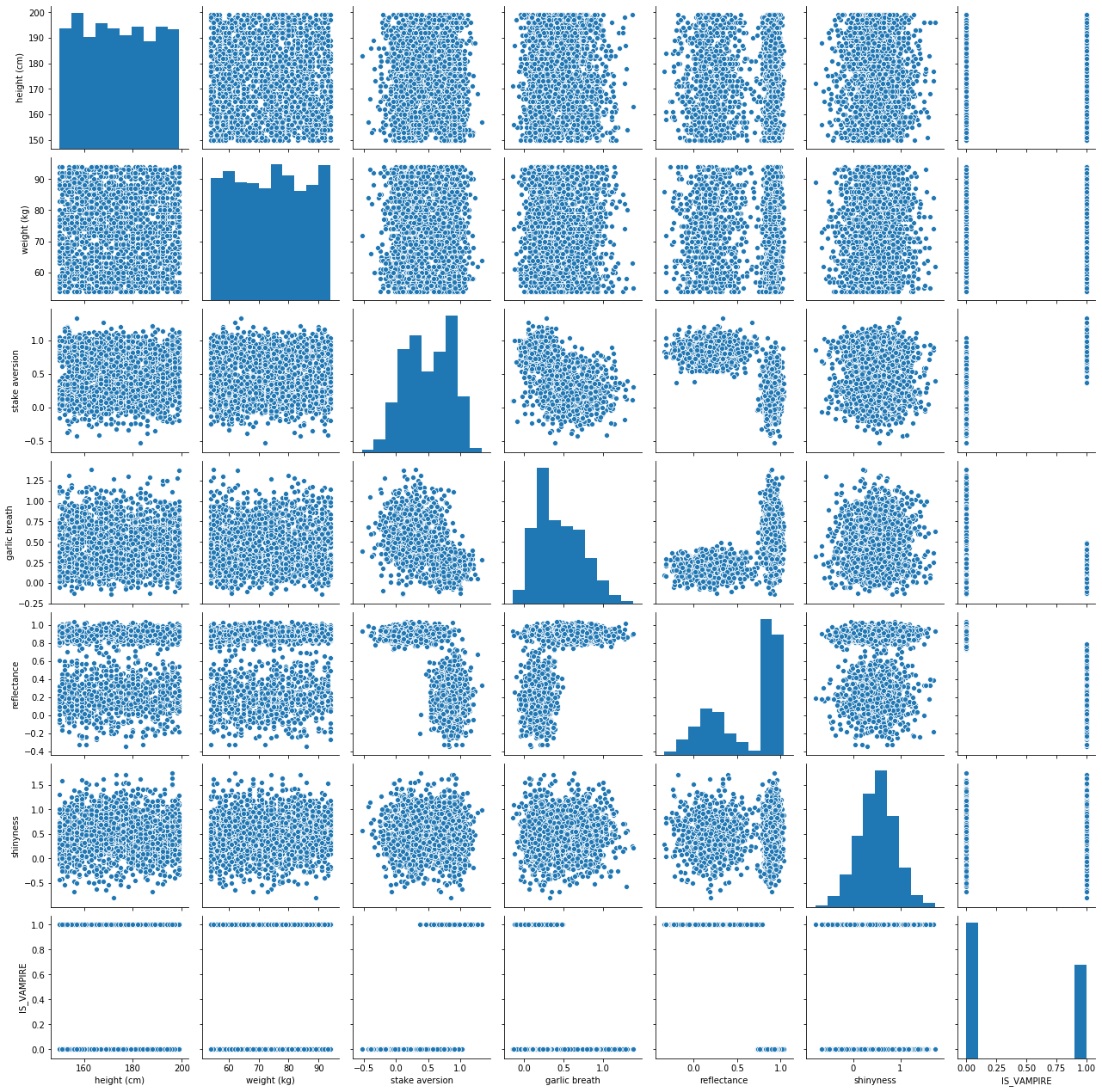
Don’t panic, it’s just a Pair Plot
I know there is a lot of information here
It’s actually simple to unpack this
Basically, we’re plotting each feature against every other feature in scatter plots
- Along the diagonal, when we have a feature compared to itself, we simply have the histogram/distribution of data
It’s cool and useful to think of the histograms and scatter plots together
- Seaborn makes this easy
Could have done with matplotlib, but this saves us some time
Question
Do you notice anything interesting here?
Let’s try seeing if there are any simple linear relationships between the features/dimensions
1 2 3 4 5 6 | # Linear Correlations
cor = numpy.corrcoef(data.T)
plt.matshow(cor)
plt.xticks(range(len(LABELS)), LABELS, rotation=90)
plt.yticks(range(len(LABELS)), LABELS)
plt.colorbar()
|
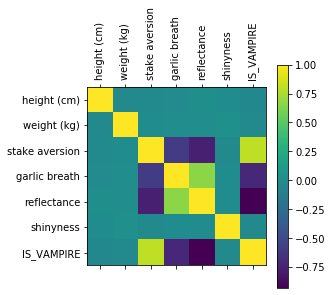
Question
Does this matrix line up with observations we made with the pair plot?
Warning
Linear correlation is great and all, but it doesn’t tell us everything because sometimes the feature might have nonlinear relationships
That pair plot was cool, but it’s hard to tell what’s really going on
- Simple solution, add another dimension to the visualization.
Colour is a dimension too you know!
1 2 | # Pair plot again, but let's add a new dimension (colouU)
seaborn.pairplot(data, hue='IS_VAMPIRE')
|
Wow, this makes it so much clearer!
- In fact, it is making it pretty obvious which features seem to matter
It’s basically jumping off the screen screaming at you
- It even made the stake aversion and garlic breath features’ histograms so much clearer
They CLEARLY look as if they are different distributions
Let’s clean up the pair plot a little more by removing the features that seem to not be too helpful
1 2 | # Pair plot again, but let's add colour AND narrow it down to what seems to be the three key features
seaborn.pairplot(data, vars = ['stake aversion', 'garlic breath', 'reflectance'], hue='IS_VAMPIRE')
|
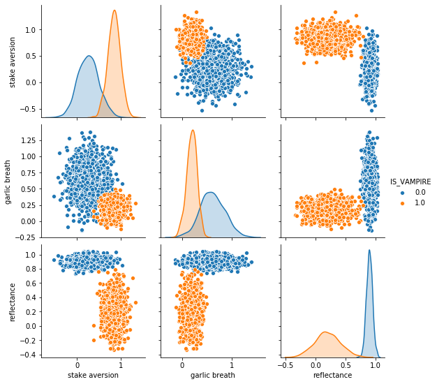
It doesn’t get any better than this!!!!
Classifying Data
Step 1: Classification with One Dimension
Question
Based on the above image, if I asked you to pick one feature to help us classify/predict if a subject was a vampire or not, which would you pick?
1 2 3 | # To me it really looks like Reflectange would be good.
plt.hist(dataHuman['reflectance'], color = 'b', alpha = 0.5)
plt.hist(dataVampire['reflectance'], color = 'r', alpha = 0.5)
|
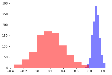
To me these look like they are obviously different distributions, but let’s geek out and be super sure with a t-test
1 2 | # Check what the p-val is
print(scipy.stats.ttest_ind(dataHuman['reflectance'], dataVampire['reflectance']))
|
If you run the above code, you get a p-value of 0.0
Obviously not really 0, but python gave up and just said it’s virtually 0
Everything at this stage is telling us that we are likely good to pick reflectance as a feature to help classify/predict if a subject is a vampire
Question
Based on the histograms, where would you pick the cutoff based on an eyeball test?
1 2 3 4 5 6 7 8 9 10 11 12 13 | # Can change for fun
CUTOFF = 0.75
# ACTUAL
y = data['IS_VAMPIRE']
# My prediction based on my cutoff
y_hat = []
for d in data['reflectance']:
if d < CUTOFF:
y_hat.append(1.0) # is a vampire
else:
y_hat.append(0.0) # is a human
|
The above code just goes through each data point and checks if the reflectance is above or below our cutoff
How accurate am I?
1 2 3 4 5 6 7 8 | # Compare each y and y_hat
correctCount = 0
for i in range(len(y)):
if y[i] == y_hat[i]:
correctCount += 1
print('Accuracy: ' + str(correctCount/len(y)))
print('Number Wrong: ' + str(len(y) - correctCount))
|
If you run the above code, you get:
Accuracy: 0.997
Number Wrong: 6
WOW! That’s actually amazing!
We want a better view of the accuracy though, so let’s go with:
True Positive
True Negative
False Positive
False Negative
1 2 3 4 5 6 7 8 9 10 11 12 13 14 15 16 17 18 19 20 21 22 | # Compare each y and y_hat
# Assume 1 for IS_VAMPIRE is a *positive*
TP = 0
FP = 0
TN = 0
FN = 0
for i in range(len(y)):
if y[i] == 1.0 and y_hat[i] == 1.0:
TP += 1
elif y[i] == 0.0 and y_hat[i] == 1.0:
FP += 1
elif y[i] == 1.0 and y_hat[i] == 0.0:
FN += 1
elif y[i] == 0.0 and y_hat[i] == 0.0:
TN += 1
else:
print('Something went wrong')
print('True Positive Rate: ' + str(TP/(TP + FN)))
print('True Negative Rate: ' + str(TN/(TN + FP)))
print('False Positive Rate: ' + str(FP/(FP+TN)))
print('False Negative Rate: ' + str(FN/(TP+FN)))
|
If you run the above code, you get:
True Positive Rate: 0.9963144963144963
True Negative Rate: 0.9974704890387859
False Positive Rate: 0.002529510961214165
False Negative Rate: 0.0036855036855036856
If our rule is If their reflectance is less than 0.75, then they are a vampire, that’s brilliant
- You can basically not do better than that in terms of the simplicity of a classifier
We love when our rule/function/classifier/model is easy to explain
Step 2: Classification with Two Dimension
Obviously we’re happy with our simple rule, but can we do better by including a new dimension?
Question
Based on the pair plot (same as before), if you wanted to include two dimensions for classification, which would you pick?
Don’t think about a single point anymore (like with the histograms/distributions), think line in 2D space
HINT: One will likely be reflectance
1 2 3 | # Reflectanve vs. Stake Aversion looks good
plt.scatter(dataHuman['reflectance'], dataHuman['stake aversion'], color = 'b', alpha = 0.5)
plt.scatter(dataVampire['reflectance'], dataVampire['stake aversion'], color = 'r', alpha = 0.5)
|
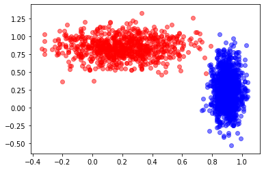
Question
If you could draw a straight line, how accurate do you think you could get?
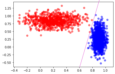
Looks like I could get perfect, or perhaps 1 false negative.
I wonder if there is a handy way to easily find the line?
Step 3: Classification with THREE Dimension
1 2 3 4 5 6 7 8 9 10 11 | # 3D Plot
# I'm sorry, but this is somewhat *magic code*
# Sorry, I know... :(
import matplotlib.pyplot as plt
from mpl_toolkits import mplot3d
fig = plt.figure()
ax = plt.axes(projection='3d')
ax.scatter3D(dataHuman['reflectance'], dataHuman['stake aversion'], dataHuman['garlic breath'], color = 'b', alpha = 0.5)
ax.scatter3D(dataVampire['reflectance'], dataVampire['stake aversion'], dataVampire['garlic breath'], color = 'r', alpha = 0.5)
ax.view_init(40, 60)
|
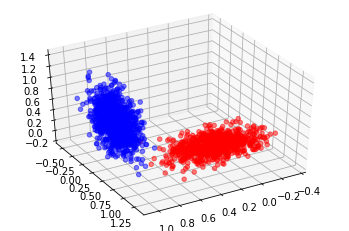
Imagine creating a plane to split this data now… I’m betting we could probably get 100%
I wonder if there is a handy way to easily find the plane?
Step 4: Classification with Four+ Dimension
Well, we’re out of useful ones here, but there is nothing stopping us from using higher dimensions if we had them
Just a little hard to visualize
Dimensionality
If we only have the one dimension, how many data points do we need to fill our domain?
It’s a continuous value, but it looks like it has two decimal points
Looks like the low for reflectance is roughly -0.35 and high of 1.05
Total of roughly 140 values
If we have the two dimension, how many data points do we need to fill our domain?
140 from reflectance
Stake has a low of -0.53 and a high of 1.33, for a total of 186
That means we need 140 * 186, or 26,040 data points to fill that space
If we have the three dimension, how many data points do we need to fill our domain?
26,040 from reflectance and stake aversion
152 for garlic
3,958,080 points needed to fill that space
Obviously the observations could be for the same values
And not all the areas of the space would necessarily be occupied
BUT, it does show that we need more and more data the more features/dimensions we want to use
Drawing the Straight Line?
Question
Before we drew a straight line and got like 0 or maybe 1 error
If I asked you to draw a curved line, do you think you could get 100% for sure
I suppose we don’t even need lines…
K-Nearest Neighbours
If it looks like a dog and barks like a dog, it’s probably a dog
Question
We will cover K-Nearest Neighbours in our Machine Learning lecture, but for now, here’s a preview
1 2 3 4 5 6 7 8 9 | from sklearn.neighbors import KNeighborsClassifier
# Select the 2Ds we liked the most (ignore 3rd because this is easier)
X = data[['stake aversion', 'reflectance']]
# Consider the 2 closest neighbours
knn = KNeighborsClassifier(n_neighbors = 2)
knn.fit(X, y)
print(knn.score(X, y))
|
0.9985
1 2 3 4 | # Consider the 1 closest neighbours
knn = KNeighborsClassifier(n_neighbors = 1)
knn.fit(X, y)
print(knn.score(X, y))
|
1.0
Question
Why am I getting 100%?
Can you think of any problems here?
Warning
This is actually a HUGE problem with what I did
I checked how well my classifier worked on the data it was trained on/fit to
I have no idea how well this generalizes
This is also probably overfit
This is not to say that we did not learn something valuable, but that we need to be careful about our conclusions at this stage
Question
Any ideas on how to fix this big problem?
Understand that this is just a light introduction
- We will learn a lot more about Machine Learning next class
But that will also be a light intro like today’s lecture
- If you have a scratch to itch in the meantime, check out Google’s Machine Learning Crash Course
You have all the necessary skills to have at it
It’s a little Artificial Neural Network heavy, but it gets the point across
Next Class: Machine Learning