Graph Presentation
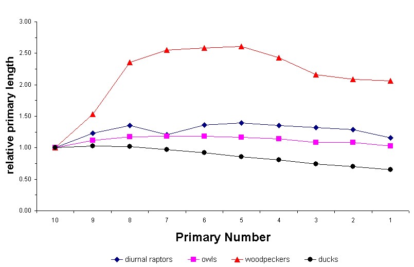
Correct: The graph above illustrates the default in Excel. Note that there is a straight line joining two adjacent points, which is correct.

Incorrect: The graph above illustrates smoothing, a feature that looks nice, but is not correct.
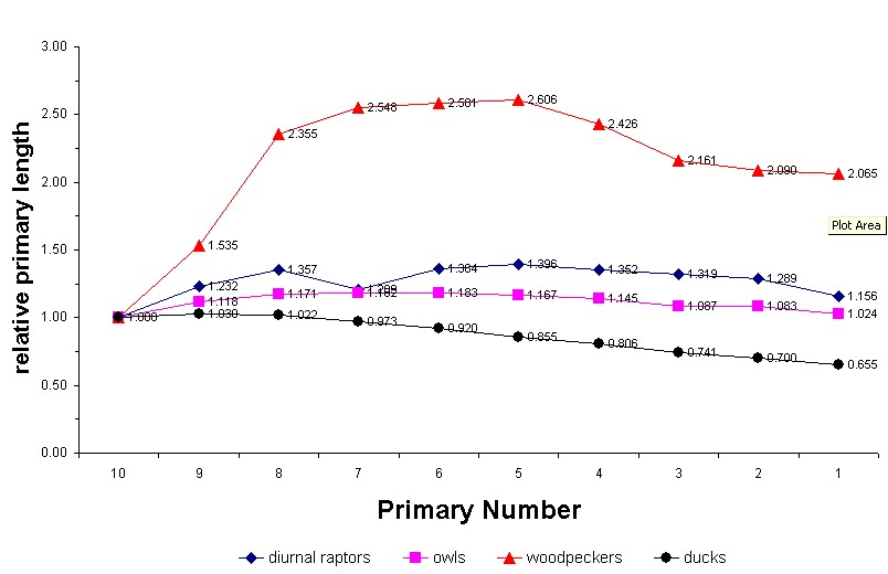
Also incorrect: The graph above has the values showing, a feature that makes the graph look cluttered. It's pointless anyway...that's what the y-axis is for.
 |
R.F. Lauff
|