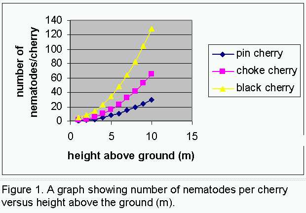
Graph Presentation

This outline is intended to help you present proper graphs. Some of the "errors" that are present on graphs are not really errors at all -- they arise from not knowing how to properly use a graphics package. A graphics package can make your figures look great...but not necessarily. There is nothing wrong with submitting a hand-drawn graph (on graph paper), as long as it follows all the necessary conventions for graphing.

What follows is a summary of the most often made errors in data and data presentation. Avoid these mistakes by rejecting the default values in the graphing software. See the examples below.

1) Axes

    1. Both should start at zero. There are exceptions to this rule, consult your lab instructor or professor if you think you may have an exception.

    2. Increment the numbers by "easy" steps, not in 17 second increments, but every 10 seconds or 10 minutes, as appropriate; an unlabelled tick mark between labelled tick marks is very useful.

    3. Format the axes (double-click an axis to format it) -- all numbers (on one axis) should have the same precision, e.g. do not have a pH scale of 3, 3.5, 4, 4.5 etc. Change it to read 3.0, 3.5, 4.0, 4.5...

    4. Don't jam numbers together on the axes.

    5. Decimals must be preceded by a numeral. For example, 0.1 is a number, whereas .1 is not.

    6. Axis titles must be present and have units (if appropriate); units are expressed using standard abbreviations and are included in parentheses.

2) Data Depiction

    1. The lines connecting the different sets of data points (if present) should be noticeably different -- one dashed, one dotted, one solid, for example.

    2. Do not smooth the lines. See the examples.

    3. Data are typically averaged and each average is represented on the graph by a symbol. Use different symbols on the different lines.

      1. If you're showing averages, please show some measure of variability, e.g. standard error, standard deviation...if you don't know how to put these in with excel, then write them in by hand afterwards.

    1. A separate key is usually not included, but if it does, must be at the bottom.

      1. The default position in Excel is the side (yuck).

      2. It should be clear to anyone what the different curves represent.

      3. It is almost always best to incorporate the definitions of the symbols in the caption, this is preferred. See the examples below.

      4. Do not put units here, they are on the axis titles.


3) Other stuff

    1. A title or caption should be present (never both).
      1. Captions are necessary for formal reports; a title may be all that is required in less formal situations. Your instructor will be able to guide you on this.
      2. Either should describe what the graph shows.
      3. Captions should be single spaced and in 10 point font.
      4. Do not put units in captions.
      5. Do not explain the graph here, a brief sentence or phrase of description is all that is required (and all that will be tolerated).
    1. Do not include
      1. Borders - these have to be removed since Excel has them there as a default.
      2. Gridlines - these have to be removed since Excel has them there as a default.
      3. Background colour - this has to be removed since Excel has it there as a default.
      4. Values - this is not a default, but some people put them in anyway. Don't.
      5. Coloured symbols and lines - these have to be removed since Excel has them as a default.
  1. Watch your significant figures. Quoting a time of 13.32 seconds with a stopwatch implies that you can reliably believe your value to be accurate to 1/100th of a second.

  2. All graphs are to be submitted in black and white, therefore, work with them in black and white on the computer; some colours do not print well.

4) Cutting then pasting your graph directly into the body of your Word document is the easiest way of incorporating them into your report. Doing this will make your reports look professional.

However, if you are not so computer literate, then print off each graph separately and either literally paste them into your report, or include each on a separate sheet, immediately after that graph’s first mention.

Version 1

In this example, we see the result of plotting three sets of hypothetical data. Here, all the software default parameters were retained. It’s not a pretty graph, it’s cluttered and disproportioned, therefore more difficult to read.


The caption is long – do you really need to tell the reader that this is a graph?

Default Graph from Excel


Version 2

Several modifications have been made to make this version more informative and more aesthetically presentable.

Firstly, the border, background colour and grid lines have been removed. This alone makes the graph easier to interpret. The graph has been increased in size – note that the y-axis title now fits in one line, though it seems long relative to the axis. The axis scale has changed – it now goes to a more round figure of 150, which has been easily subdivided using minor tick marks. Some would say there are too many tick marks – what do you think? Tick marks are standard and should be included on any numerical axis. The x-axis has remained unchanged – would you change it?

Note that the data are still in colour – what would happen if this was all converted to black and white? Although the symbols are different, the lines are all the same; typically, lines for different data sets are shown differently too. The legend has been deleted – this information is incorporated into the caption (this is often done). Note that units have been removed from the caption.

Some modifications done.


Version Three

In this final version, we see that all colour has been removed. Scaling on both axes has been changed – neither are cluttered, neither are so open that interpretation is difficult. Appropriate tick marks have been added to the x-axis as well.


A subtle change is that the font size of both axes titles has been reduced to better fit the graph. Note the consistent number of decimal places on the x-axis numbers...i.e. it's not 2.5, 5, 7.5, 10.

The titles are not overwhelming, nor should they be.

The caption has been once more edited to tighten it up as much as possible. Note that now, the word "cherry" only appears once.

Final Product!


Home

home


R.F. Lauff

Department of Biology
St. Francis Xavier University
Antigonish, NS Canada B2G 2W5