Bantjes, Rod, “Mapping_Time.html,” in Eigg Mountain Settlement History, last modified, 14 August 2015 (http://people.stfx.ca/rbantjes/gis/txt/eigg/introduction.html).
Mapping Time (Eigg Mountain Settlement History)
We generally think of maps as drawings of how things are laid out on the surface of the earth. It should be simple to decide what to represent on them – something is either there, so you draw it, or it is not, so you don’t. Historical maps are more complicated than this. Ideally you would just pick a year, say 1860, and only represent what was there in 1860. However, that turned out to be next to impossible to do for Eigg Mountain. First, the “1860 only” idea could still leave out important information for modern users such as how to get there. It is useful to know which roads exist now that didn’t exist then and which old roads no longer exist or would be impossible to drive on. I solved this problem by including all current roads and tracks plus all the old roads that we know existed in the 19th century. Old roads (but not driveways) I have indicated with a rusty orange colour. The result is a map showing things that never existed together such as “Harry’s Logging Road” and the road from Lauchie MacEachern’s place through the Power’s Brook gully up to Hugh MacDougall’s (Figure 1). Elapsed time is now built into the spatial representation.
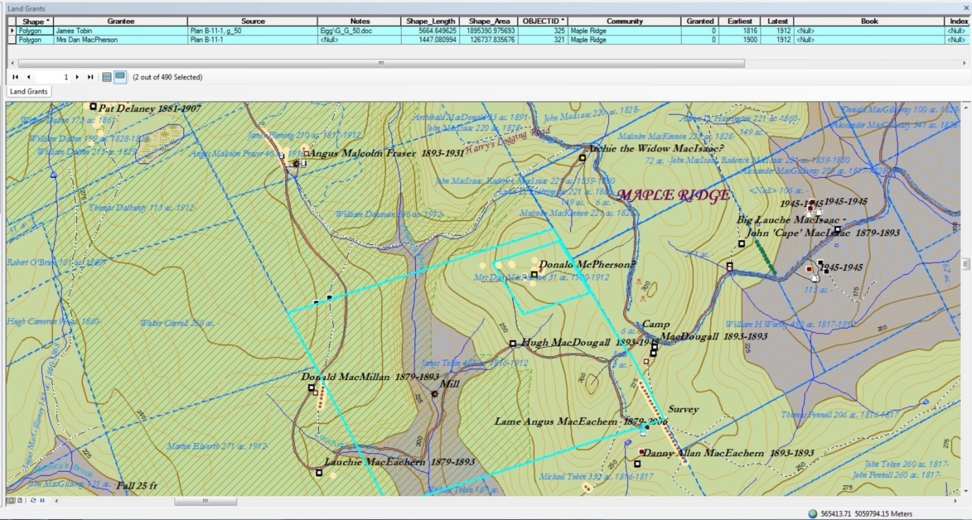 |
Figure 1 – ArcView Map as Database. |
| Each feature (in this case a property boundary highlighted in turquoise) is linked to an underlying database record (revealed in the band at the top). |
My grand vision was to date every aspect of the built environment that was represented on the map. Each point, line or polygon (i.e. area) appears in ArcView both as an image, but also as a record in a database (on the map, records can be viewed as lines in a spreadsheet, see Figure 1). I constructed two fields in each database indicating the earliest that a feature was known to exist [ExEarliest] and the latest [ExLatest]. I could then have told ArcView to draw only those features that existed in 1860 (when [ExEarliest] <= 1860 and [ExLatest] >= 1860) and in this way produced a rigorous series of maps for different years – say, one every census year. The series could have provided a kind of animated picture of changes over time as settlement grew, changed and eventually declined. This vision quickly faded when I saw how sparse the historical evidence was and how difficult it was to link census records to places on the ground. It was hard enough often to get one date for a historical feature, never mind a reliable span of years.
Another possibility that I considered was to conceive of the map as a record of the traces of the past that could still be found in the landscape in the 21st century. That way everything could be roughly contemporaneous with the period of our survey: 2003 to 2015. But again, important information would have been left out. So, for example, we have good evidence that a foundation existed at the John MacIsaac site in the 1950s (the house was on the Church Map and Charlie had seen the foundation in a fairly easily locatable spot), but it had apparently been bulldozed in. Since it no longer existed it should not have been on the map. Not wanting to lose any record of what we actually learned from the survey, I started at one point indicating the foundations (feature code “BLBS04”) with known dates and superimposing a separate feature at the same spot for the house (code “BLDW60”) also with known dates.[1] I programed ArcView to draw buildings first and foundations later so the symbols for foundations get drawn over top of the symbols for buildings, and normally all you see is the foundation symbol. In cases where you can see a house still standing in the 1945 aerial photos, and where we have not surveyed the site, ArcView will draw a house, even though there may no longer be one there in 2015. So there is now quite a strange mix of times represented on the map.
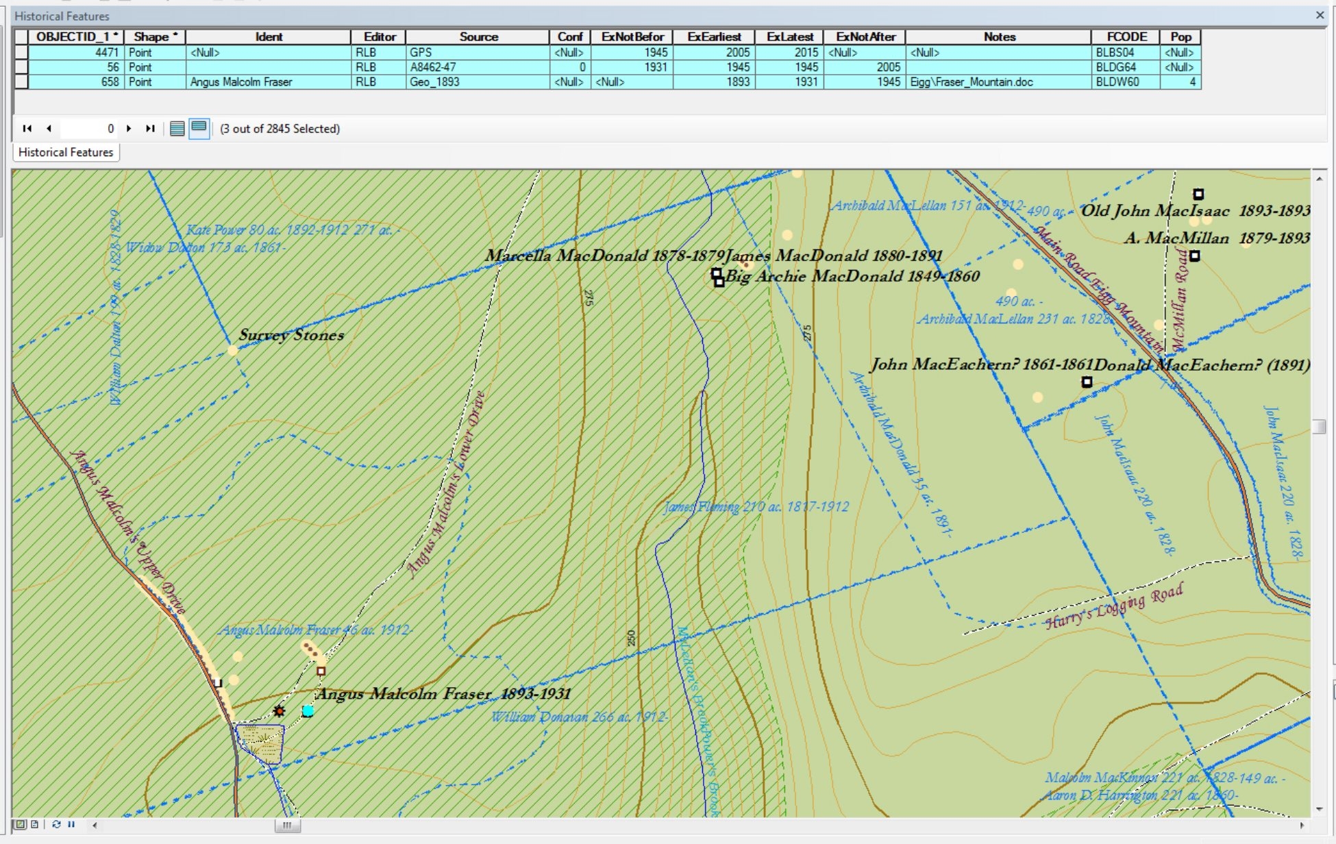 |
Figure 2 – Overlapping Features /Records |
| Here you can see multiple records tracking the changes from an occupied house (feature code [FCODE] “BLDW60”) to an abandoned and derelict house (BLDG60) to the remains of a foundation (BLBS04). |
The more important difficulty with the “as it exists in the 21st century” idea was that there would be no coherent way to attach people’s names to any of the old sites. This latter is still a problem. Lands and buildings changed hands, often numerous times within families and between apparently unrelated individuals, so the question becomes “whose name should go on the map?” Strangely, what we know about who owned the land is not always consistent with what we know about who owned or occupied the buildings located on that land. Since one of the main purposes Charlie and I share has been to attach people to the land, I have opted with some hesitation to squeeze everything we know onto the map. A single foundation can have as many as three names attached to it and it can be located on a parcel of land with three additional names – not all of them the same as for the house or foundation. Names come with date ranges and people from different time periods are placed one on top of another in duplicate records. What that means is that there are actually three records of the same building with different owners listed (see for example the Big Archie MacDonald site).[2] In the case of land there can be three records of the same boundaries (see the parcel described in Deed 502479999).[3] All of this overlapped information can become messy and hard to make sense of, particularly where property boundaries change over time (see for example the Mooney /Fraser property, Figure 3). (Concerning the vagueness and inconsistencies in property boundaries see Making Claim to the Land.)
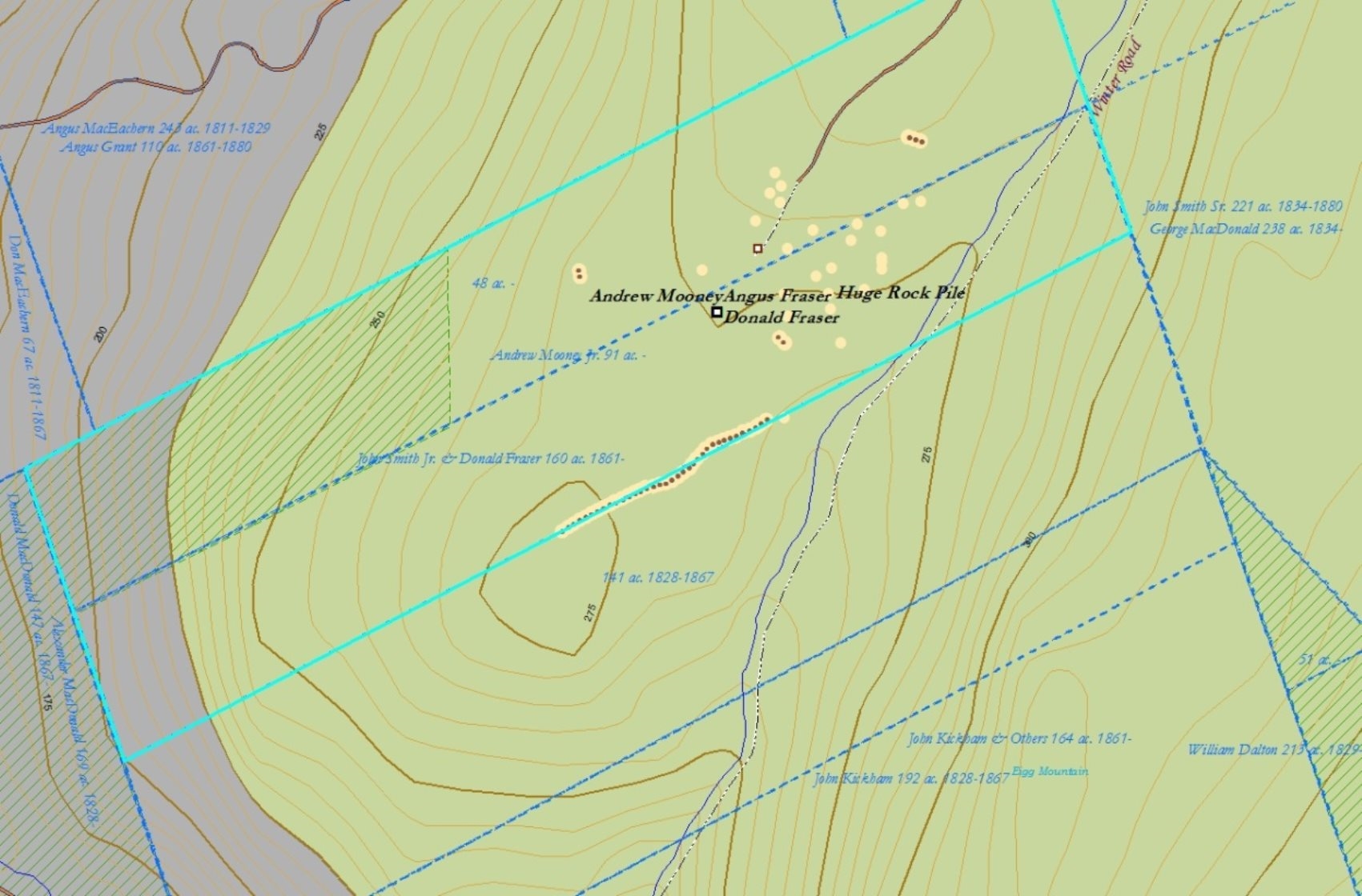 |
Figure 3 – Multiple overlapping land grants. |
|
The property highlighted in turquoise represents the land as actually farmed. The boundaries can be seen on the ground (the rock wall) and in an aerial photo from 1945 (see Mooney/Fraser), but we have found no written record of it and have not attributed any name to it. |
You might think that the underlying geography – that is, the shape of the land outlined by coasts, rivers and the boundaries of lakes – would remain fixed and unchanged and thereby be immune to these problems of representing time. But that is not the case on Eigg Mountain, where there have in this respect been significant changes in the land. The only lake on the mountain – Rory’s Lake – became Vincent’s Lake in the 1960s after Vincent MacDonald, then Mayor of Antigonish, initiated a project to divert its waters into the town water supply. A stream that flowed west out of the lake is now missing, replaced by a channel (which local people call the moat) which flows south into a different watershed. Both outflows from the lake were dammed raising the water level, increasing the lake’s size and changing its outline on the map. I would like to restore the old shapes of the lake, streams and watershed for the historical map. I still have date fields in the map layer for bodies of water in case I revive the vision of a dynamic map capable of representing the surprising ways that landscapes can change over time.
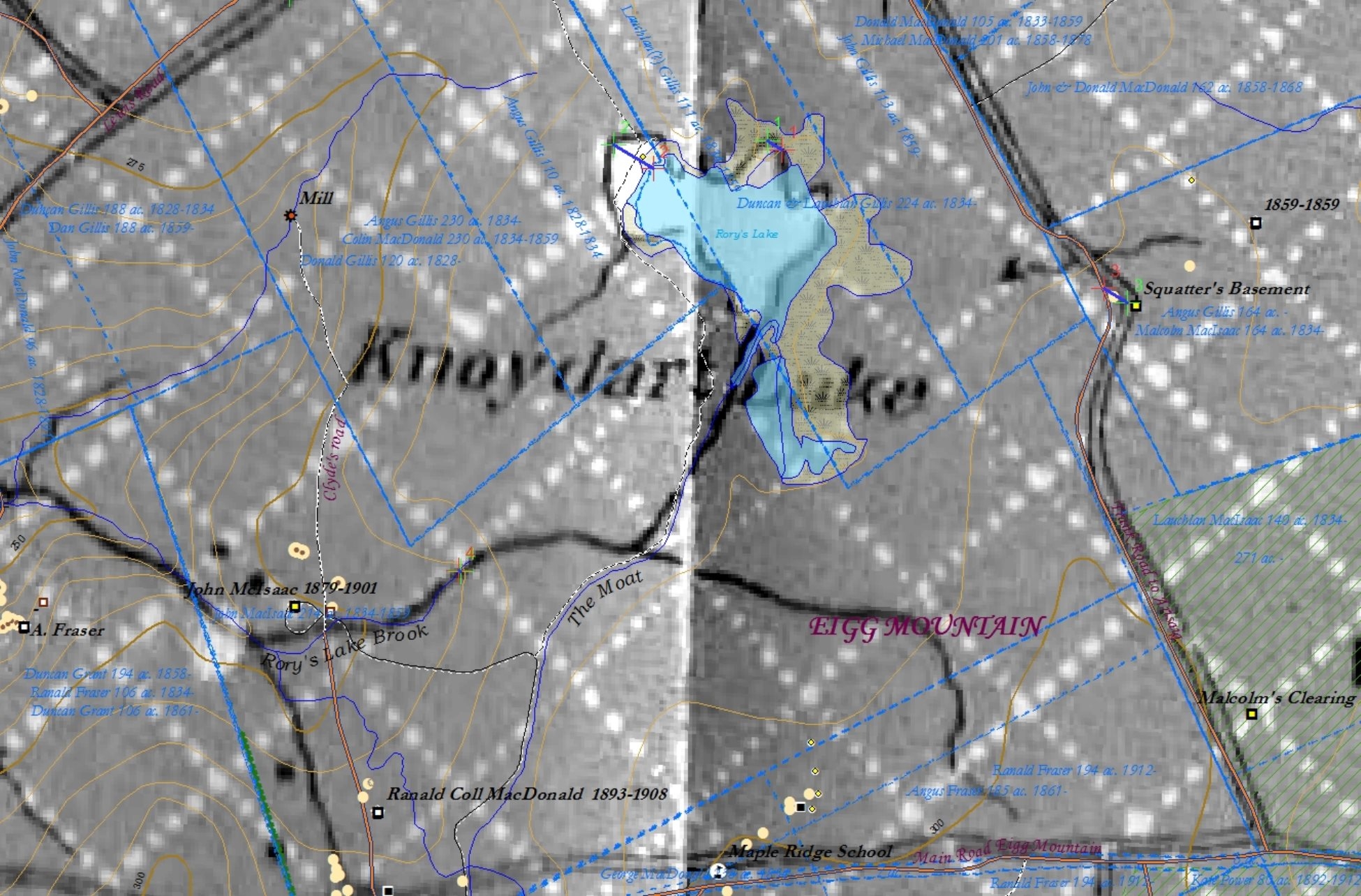 |
Figure 4 – Geological Survey Map of 1893 georeferenced to the ArcView map. |
| You can see how the Moat continues south while Rory’s Lake Brook now disconnected from the lake once turned west. The main difference in the modern shape of the lake is the extension to the south. |